

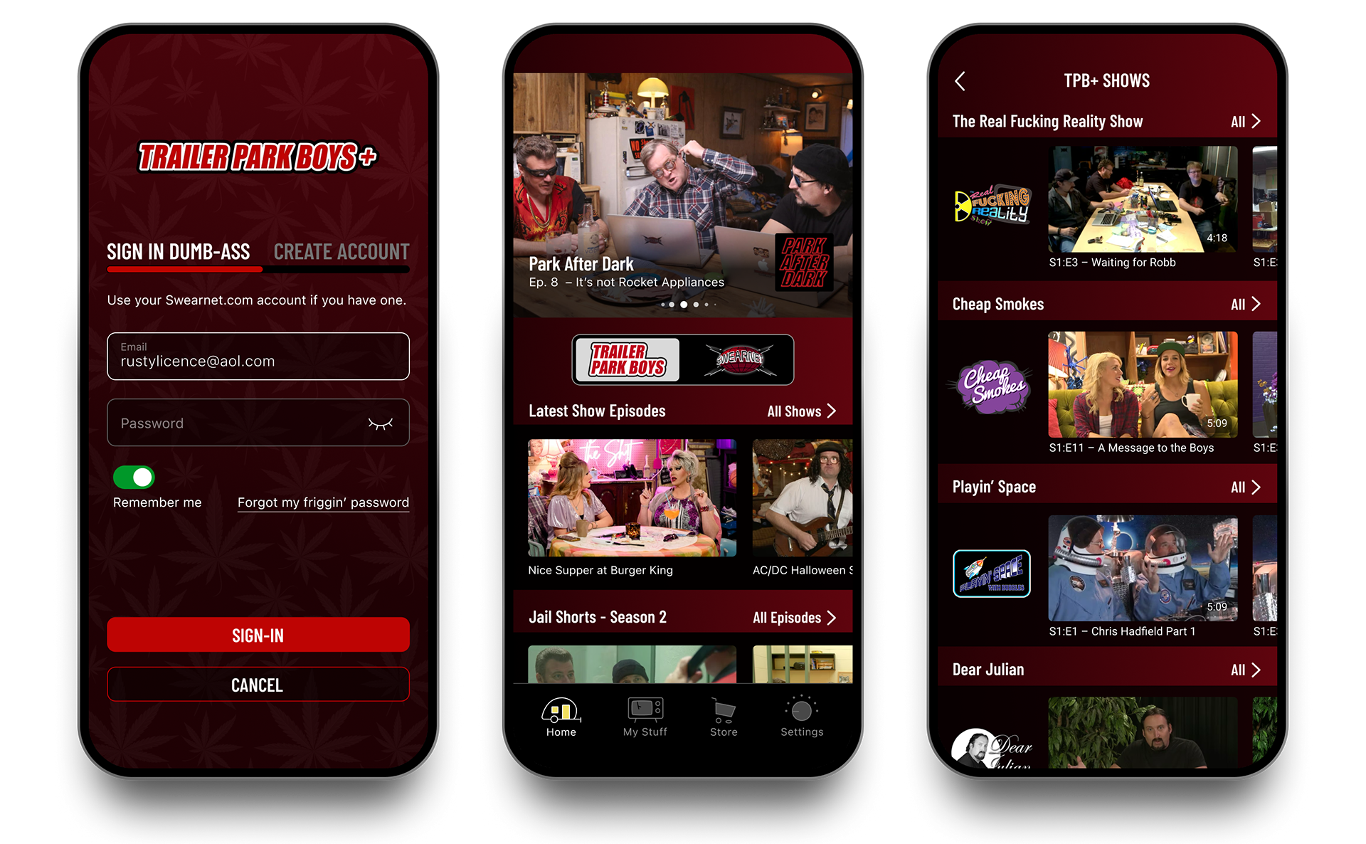
Sign-in screen. Middle: Landing screen. The top carousel with recent features or promotions. To address discoverability of other shows a quick toggle was introduced to easily switch between TPB and Swearnet channels. Right: Selected channel landing screen.
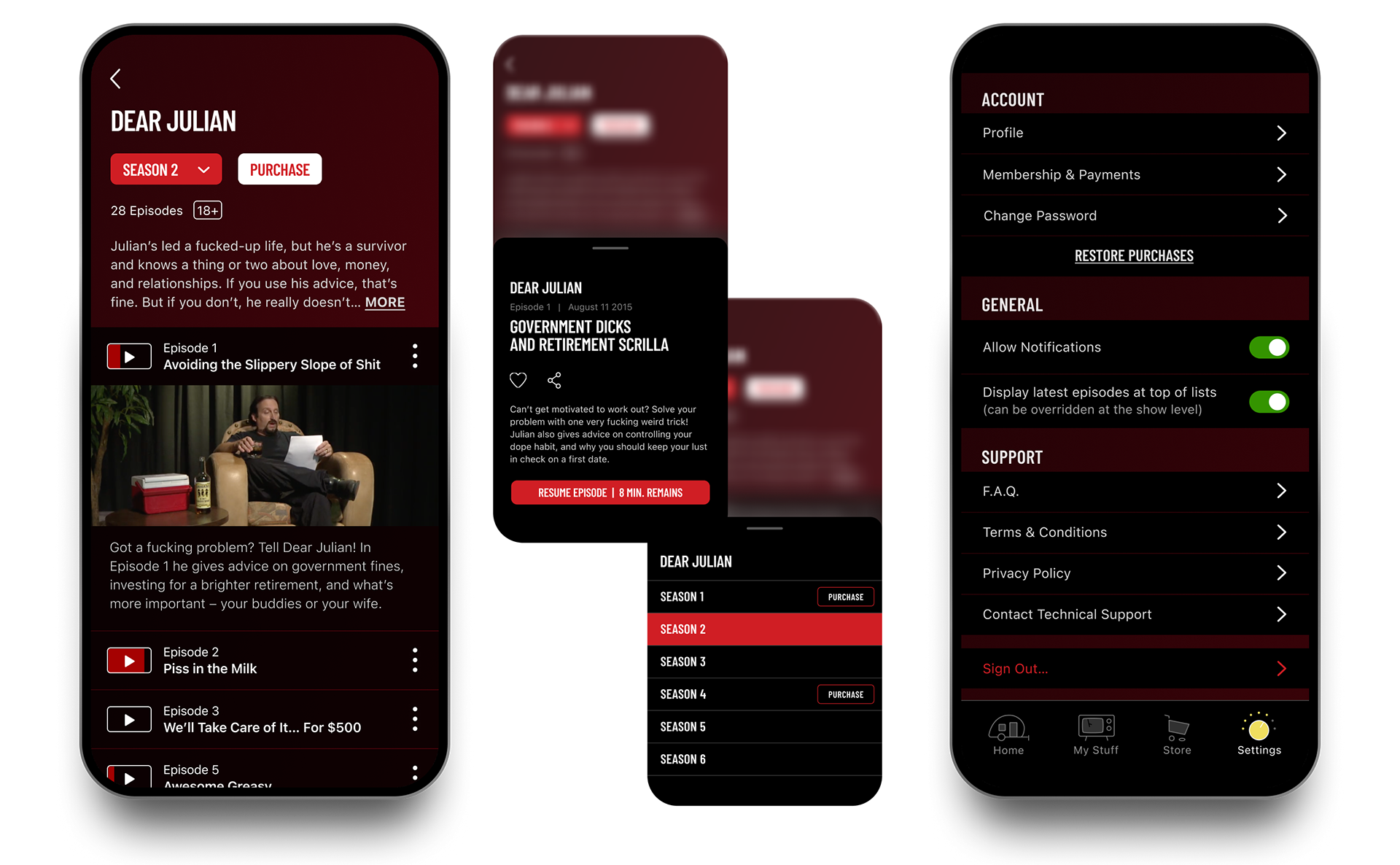
Left: Show detail screen. Middle: Information overlays; Top: Episode detail overlay when tapping on the vertical ellipses displays synopsis, Favorite and Share functions. Bottom; season selector with convenient purchasing option. Right: Settings screen.
Context
The Trailer Park Boys team set out to launch the first version of a dedicated mobile app for fans — bringing together Trailer Park Boys content, SwearNet News, streaming, and commerce in a single experience.
As an MVP, the goal wasn’t to overbuild features, but to establish a clear foundation: define the core content structure, support two distinct audiences, and deliver an experience that felt unmistakably on-brand from day one.
Challenge
As with many first-release products, the challenge was deciding what mattered most at launch.
• Multiple content types needed to live together without confusion
• Two audience groups had different expectations and usage patterns
• Navigation had to be immediately understandable with minimal onboarding
• Two audience groups had different expectations and usage patterns
• Navigation had to be immediately understandable with minimal onboarding
The risk wasn’t missing features — it was launching without a clear mental model for users. The MVP needed to feel complete, even while leaving room to grow.
Role
• UI/UX Lead — Organized structure and interaction flows
• Designed custom navigation iconography (including a memorable trailer-shaped home icon)
• Defined brand-aligned UI language, including functional use of foul humour where appropriate
• Designed key screens: registration, home, channel toggles, show listing, detail screens, and user libraries
• Designed custom navigation iconography (including a memorable trailer-shaped home icon)
• Defined brand-aligned UI language, including functional use of foul humour where appropriate
• Designed key screens: registration, home, channel toggles, show listing, detail screens, and user libraries
Approach
The design focused on defining a strong core experience that could scale over time.
1. Audience-first structure
The app clearly separated Trailer Park Boys content and SwearNet News into distinct zones from the start, ensuring users immediately understood where they were and what they could do.
2. Brand-forward, functional UI
Visual language and iconography were designed to carry the Trailer Park Boys personality without compromising usability — setting a tone that could be expanded in future releases.
3. Launch-ready discovery and commerce
Key flows for content discovery, streaming, and purchasing were intentionally streamlined to support early adoption and validate user behavior before adding complexity.
Outcome
The redesigned app accomplished multiple business and user goals:
• Clear separation of content types (fans vs. news) reduced confusion and improved engagement.
• Improved discoverability of shows and episodes through streamlined navigation and hierarchy.
• Brand-aligned experience that resonates with the show’s humour and voice without sacrificing usability.
• Improved discoverability of shows and episodes through streamlined navigation and hierarchy.
• Brand-aligned experience that resonates with the show’s humour and voice without sacrificing usability.
This project wasn’t just about screens — it was about organizing disparate content within a recognizable brand ecosystem.
Interested in branded mobile experiences that balance character with clarity?