

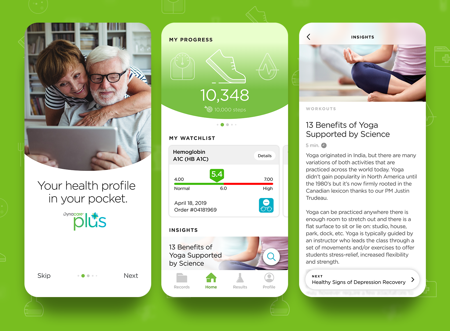
Left: Onboarding screen. Middle: Home screen. Right: Article screen.
Context
Dynacare Plus is a mobile app designed to help Canadians access and manage personal health information — including lab results and wellness metrics — from their phones. The brief called for a UX/UI refresh that would make the experience more intuitive, friendly, and usable for a broad demographic, particularly users who may have limited tech comfort or medical literacy.
Challenge
Healthcare data is inherently complex. For an app like Dynacare Plus, the key challenges were:
• Technical language that can intimidate or confuse users
• Dense interfaces that frustrate rather than inform
• Limited engagement with health tracking or continuity features
• Dense interfaces that frustrate rather than inform
• Limited engagement with health tracking or continuity features
In a space where people need clarity — sometimes urgently — the original UX/visual design wasn’t helping users feel confident or in control of their health information.
Role
Led the UX and UI redesign with a focus on:
• Designing clean, human-centered UI
• Creating custom iconography and visual cues
• Interpreting medical and lab data into understandable formats
• Introducing micro-interactions and UI refinements to increase engagement
• Concepting animations for key screens (e.g., splash experience) Roberto's Work
• Creating custom iconography and visual cues
• Interpreting medical and lab data into understandable formats
• Introducing micro-interactions and UI refinements to increase engagement
• Concepting animations for key screens (e.g., splash experience) Roberto's Work
This was a design leadership role that balanced clarity with accessibility in a regulated domain.
Approach
Rather than forcing users to “learn the app,” the redesign helps the app adapt to the user.
We stripped visual noise and prioritized:
• Legible typography
• Clear information hierarchy
• Minimal cognitive load
• Legible typography
• Clear information hierarchy
• Minimal cognitive load
This matters most when someone is reviewing lab results that can feel technical or unfamiliar.
Lab results were redesigned with:
• Trend graphs that visually explain health changes
• Simple toggles for deeper insight
• A “Watchlist” feature to monitor specific metrics over time
• Trend graphs that visually explain health changes
• Simple toggles for deeper insight
• A “Watchlist” feature to monitor specific metrics over time
Making data feel meaningful was a core UX driver rather than just presenting numbers.
Engaging, interactive details
Small interactions — like animation cues on launch and contextual icons — help users feel guided, not overwhelmed.
Outcome
The redesign achieved several key improvements:
• A more approachable UI for an audience that skews older or less tech-savvy
• Visual clarity that reduces guesswork when reviewing results
• Features that support ongoing health engagement (e.g., trends and watchlists)
• Visual clarity that reduces guesswork when reviewing results
• Features that support ongoing health engagement (e.g., trends and watchlists)
This wasn’t a superficial facelift — it moved the product toward meaningful user empowerment in a space that can be intimidating.
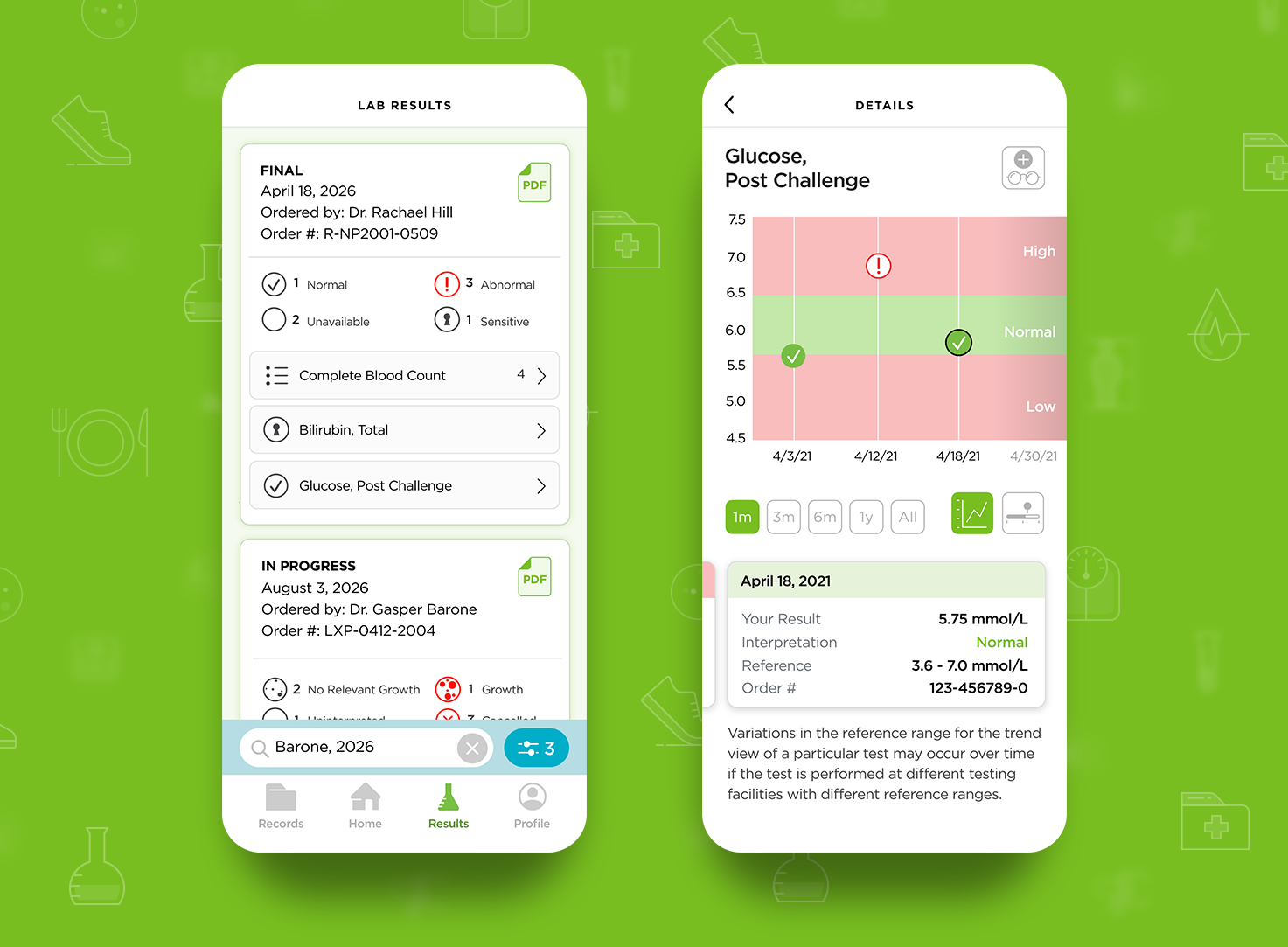
Left: Overview of lab results. Right: Lab result details. Viewing functions include trend or bar graphs and a 'My WatchList'.
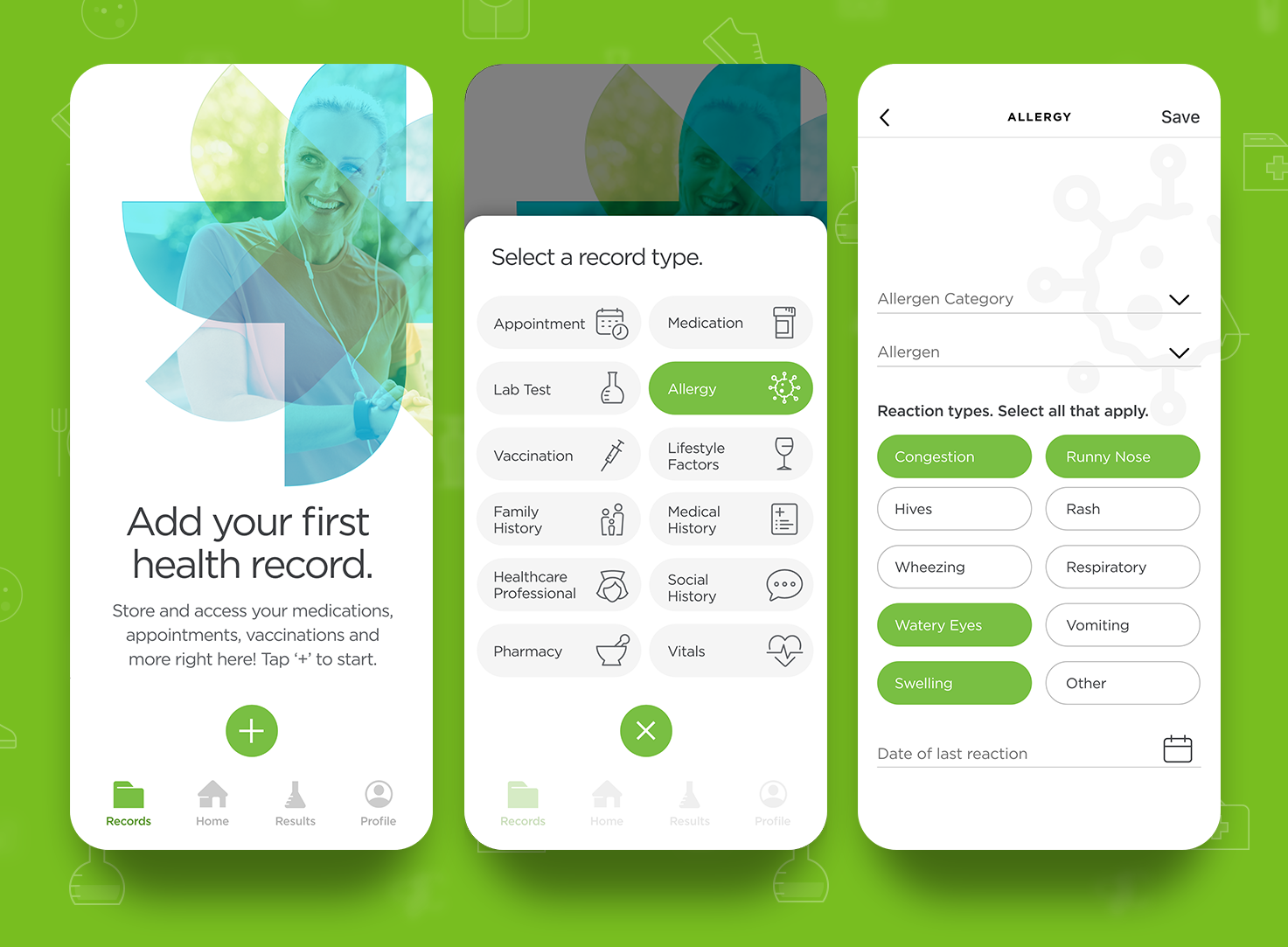
Left: Health Records 'empty' state until a first record is created. Middle: Record categories. Right: Category details screen.
Interested in solving a health UX challenge like this one?