

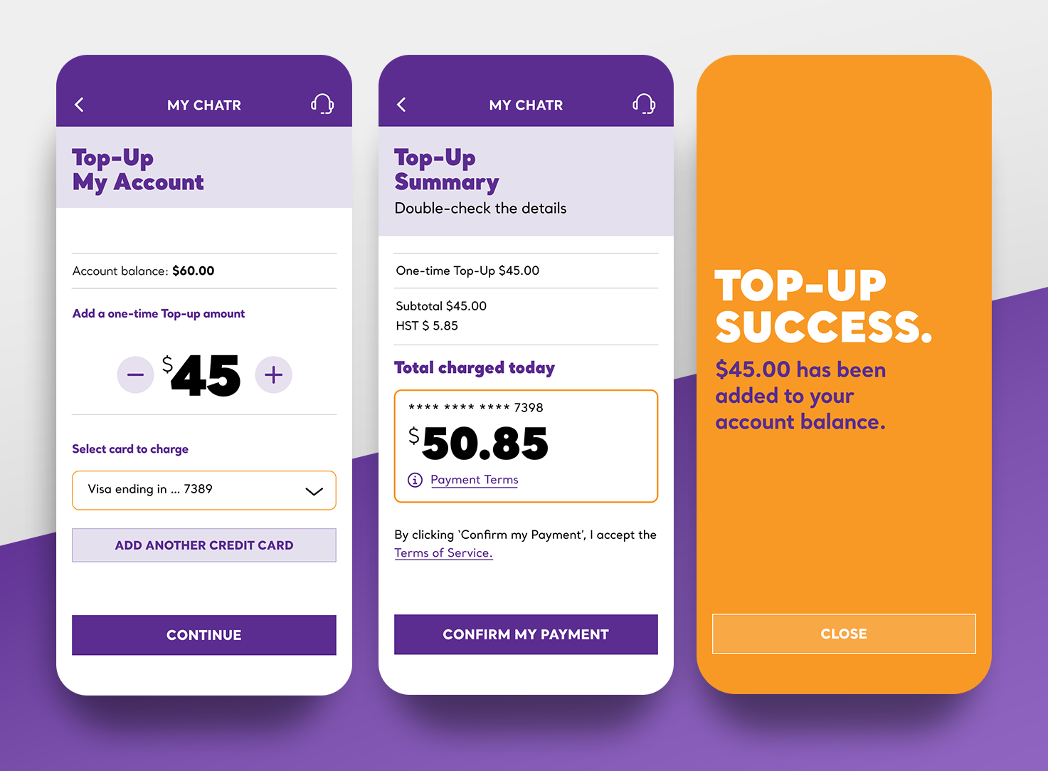
Left to right: Account funding; funding summary; funding confirmation.

Left to right: Account screens.
Context
Chatr, Rogers’ value‑oriented mobile brand in Canada, needed its first mobile account management app for pay‑as‑you‑go users. The core objective was straightforward: give customers a simple way to access and control their account details, top‑ups, and balances — and in doing so, cut down on expensive call‑centre traffic.
Challenge
The existing service experience funneled most issues into high‑cost support channels. Users calling in for basic tasks like checking balances, recharging, or reviewing usage put unnecessary load on contact centres. The business needed a self‑service mobile solution that users of all tech levels could adopt without friction.
Role
• UI Lead & UX Co‑Lead
• Crafted original icons and screen designs
• Conducted competitive research
• Delivered full UI in a 3‑month design timeline
• Crafted original icons and screen designs
• Conducted competitive research
• Delivered full UI in a 3‑month design timeline
Approach
Rather than recreating the complexity of a full carrier dashboard, we focused on clarity and task efficiency:
Task‑first dashboard:
We led with the activities users care about — top‑ups, balances, data and usage — eliminating clutter and highlighting actionability.
We led with the activities users care about — top‑ups, balances, data and usage — eliminating clutter and highlighting actionability.
Visual cues for confidence:
Custom iconography and clean layouts reduced guesswork. Users didn’t have to hunt for what they needed.
Custom iconography and clean layouts reduced guesswork. Users didn’t have to hunt for what they needed.
Priority flows only:
We built streamlined paths for the most common support drivers — recharging, checking usage — ensuring the app handled issues before users reached for the phone.
We built streamlined paths for the most common support drivers — recharging, checking usage — ensuring the app handled issues before users reached for the phone.
Outcome
The redesign delivered significant impact post‑launch:
• 60% reduction in call centre traffic related to the top call drivers targeted by the app.
• The app efficiently resolved half of the top ten call reasons through self‑service.
• Downloads exceeded initial targets, proving early customer adoption beyond expectations.
• The app efficiently resolved half of the top ten call reasons through self‑service.
• Downloads exceeded initial targets, proving early customer adoption beyond expectations.
This wasn’t just a facelift — it shifted support load and changed behaviour by making the app the go‑to place for everyday account needs.
Interested in experiences that shift behavior and lower support costs?