

Context
OnCare SMDx is a physician-focused mobile tool designed to support the early identification of Systemic Mastocytosis, a rare and often difficult condition to diagnose.
The app needed to work within real clinical constraints: limited time, high cognitive load, and strict privacy expectations. The goal was to deliver a focused diagnostic aid that clinicians could use quickly, confidently, and without friction.
Challenge
• Noise over signal: Too many screens or buried instructions slow down rapid assessments.
• Cognitive switching: Doctors need to focus on patients, not on onboarding or form complexity.
• Data privacy concerns: Healthcare use demands no barriers to secure, private use.
• Cognitive switching: Doctors need to focus on patients, not on onboarding or form complexity.
• Data privacy concerns: Healthcare use demands no barriers to secure, private use.
With the first version of SMDx, the challenge was to restrain the feature set to only what drives diagnostic confidence, keeping everything else minimal.
Role
• UX / UI Lead — shaping the entire interaction and visual language
• Project management — bridging client needs and developer implementation
• Workflow optimization — simplifying a clinical process into a one-screen flow
• Security-first thinking — ensuring that minimal, session-only data handling upheld privacy constraints
• Project management — bridging client needs and developer implementation
• Workflow optimization — simplifying a clinical process into a one-screen flow
• Security-first thinking — ensuring that minimal, session-only data handling upheld privacy constraints
This role demanded both tactical execution and strategic judgment — not just what the design looks like, but how it behaves under pressure.
Approach
• Immediate orientation: Users land on a concise explanation of SMDx with clear instructions—no onboarding, no setup.
• One-screen interaction: Essential inputs live on a single screen, with real-time visual feedback to support rapid evaluation without context switching.
• Privacy-first output: Results can be shared or exported instantly, with no accounts or backend data storage required.
• One-screen interaction: Essential inputs live on a single screen, with real-time visual feedback to support rapid evaluation without context switching.
• Privacy-first output: Results can be shared or exported instantly, with no accounts or backend data storage required.
Every decision favored focus, efficiency, and trust—removing anything that didn’t directly support diagnosis.
Outcome
The final app feels light, direct, and reliable — matching the expectations of medical users who need answers quickly, without distractions.
• A single streamlined workflow for rapid assessment
• Real-time diagnostic feedback that clinicians can trust
• Built-in export/sharing that fits into clinical documentation habits
• Privacy by design with zero account overhead
• Real-time diagnostic feedback that clinicians can trust
• Built-in export/sharing that fits into clinical documentation habits
• Privacy by design with zero account overhead
All of this came together without burdening users with unnecessary structure.
While the project ultimately didn't launch, the work resulted in a complete and well-considered foundation that the team could build on with confidence.
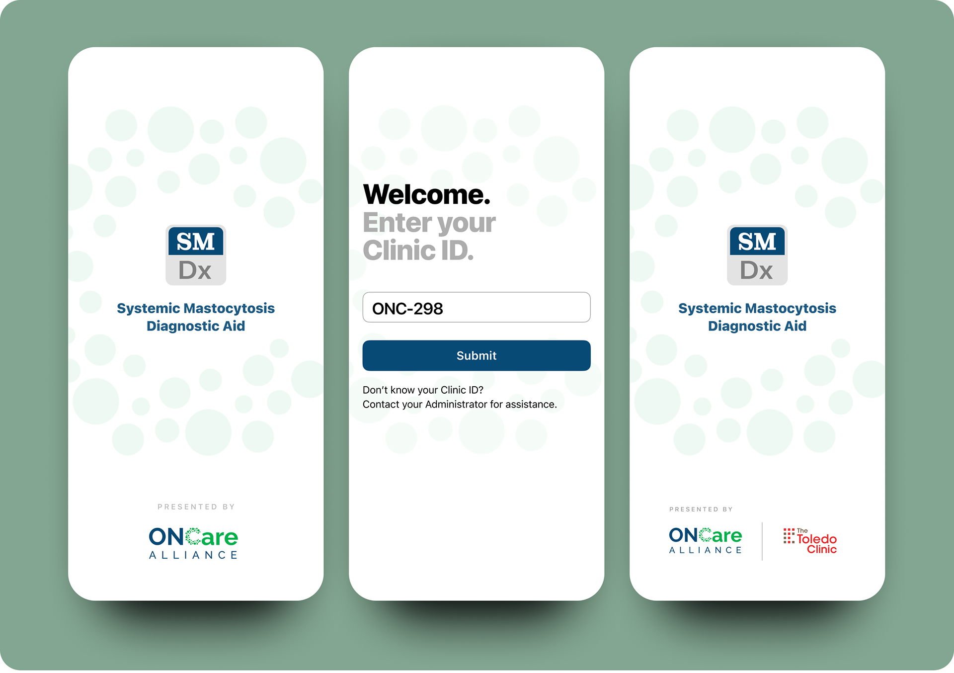
Left: First-time launch screen. Middle: Clinic ID prompt. Right: Resulting customized partnership logo splash screen.
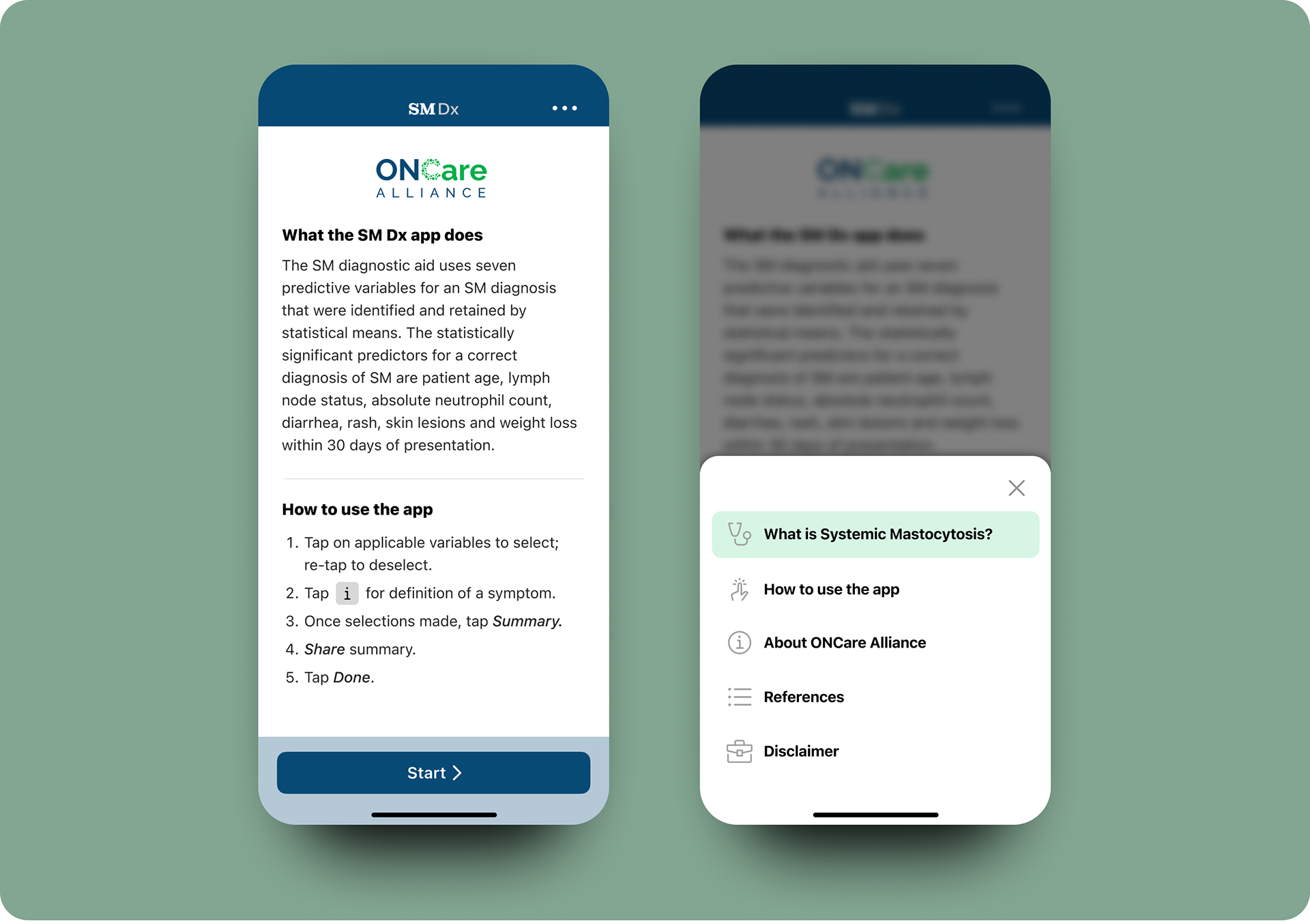
Left: Start screen with definition and app instructions. Right: Menu sheet function from ellipsis.
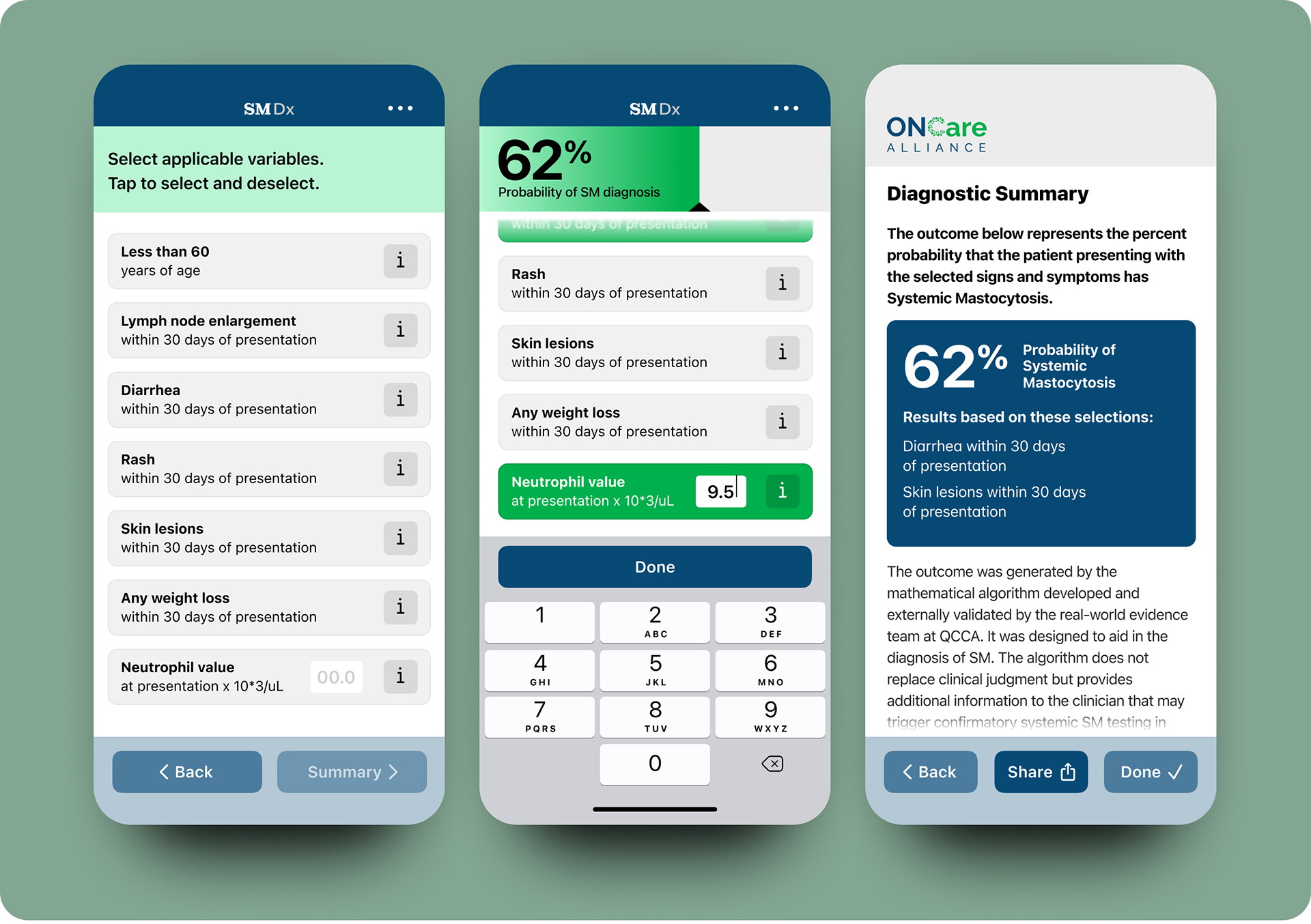
Left: Main screen selections. Middle: Entry with real-time feedback gauge at top. Right: Diagnostic Summary with Share function.
Interested in diagnostic UX that respects both speed and precision?