
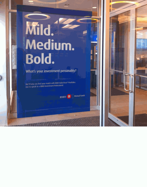
BMO
– SelectTrust Portfolios • Campaign
– SelectTrust Portfolios • Campaign
Role
Art Direction and co-copywriting.
Art Direction and co-copywriting.
Objective/Challenge
Avoid the expected advisor with client photography and pedestrian copy.
Avoid the expected advisor with client photography and pedestrian copy.
Solution
Bold, text-driven direction using ‘unbank-like’ language for wider-reaching, thought-provoking engagement. Originally written to be understood as a spice level, internal testing revealed the copy transitioned effortlessly to other food scenarios — including coffee!
Rollout included website banners, in-branch banners, ATM displays and countertop placards. Also directed single and three-screen in-branch video spots.
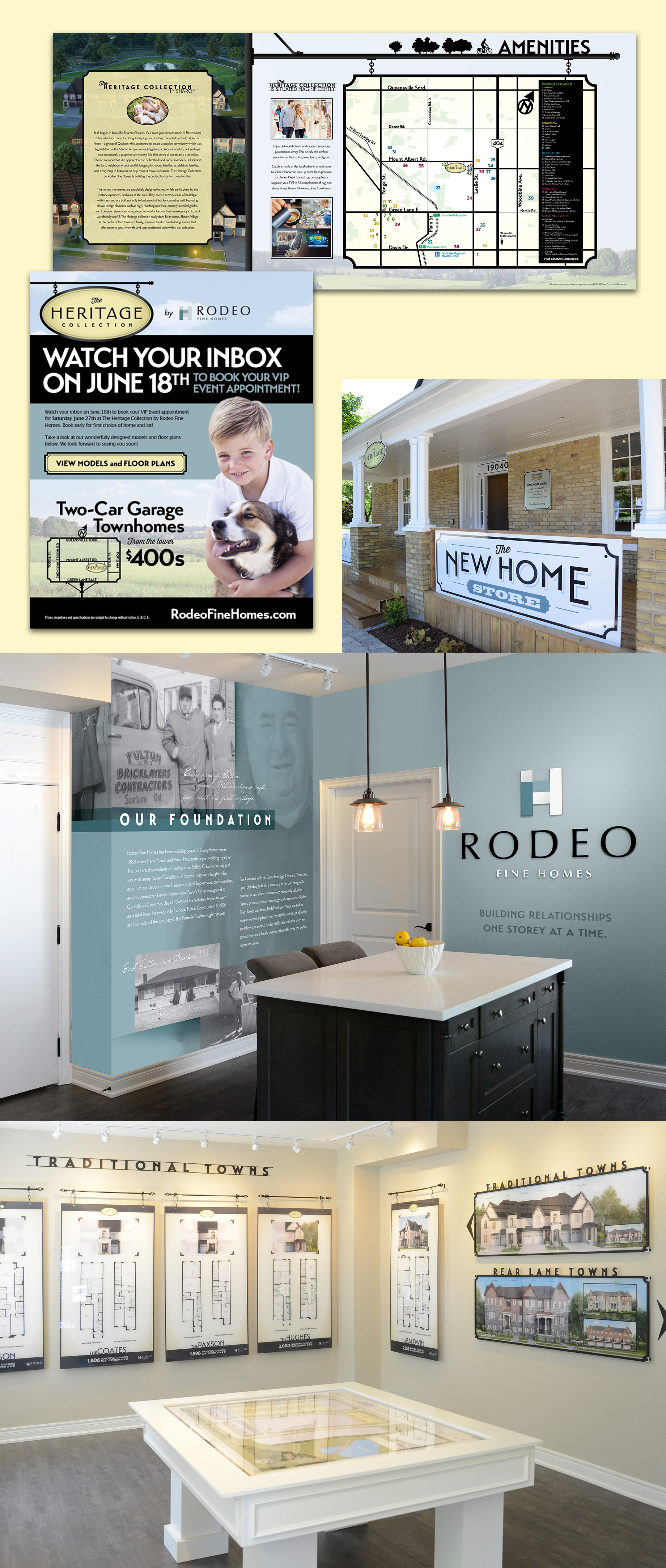
Rodeo Fine Homes
– Sales Centre Design & Collateral
– Sales Centre Design & Collateral
Role
Art Direction of all print and digital materials, and Sales Centre Interior Design.
Art Direction of all print and digital materials, and Sales Centre Interior Design.
Objective/Challenge
Limited budget and physical space for Sales Centre materials.
Limited budget and physical space for Sales Centre materials.
Solution
The development’s location and small town culture inspired the vintage 'pioneer' theme used throughout all print and online touchpoints — including the use of an original on-site home which provided a fitting canvas for the Sales Centre.
Naturally, the pioneer theme carried through the Centre in the form of physical framing and lettering machined out of mottled plastic to mimic ironwork, lending to the authentic feel. A new feature graphic created specifically for the Sales Centre was the Our Foundation wall describing Rodeo's origin story.
Shown are an example three-panel foldout from the information brochure, an email blast and Sales Centre interior design.
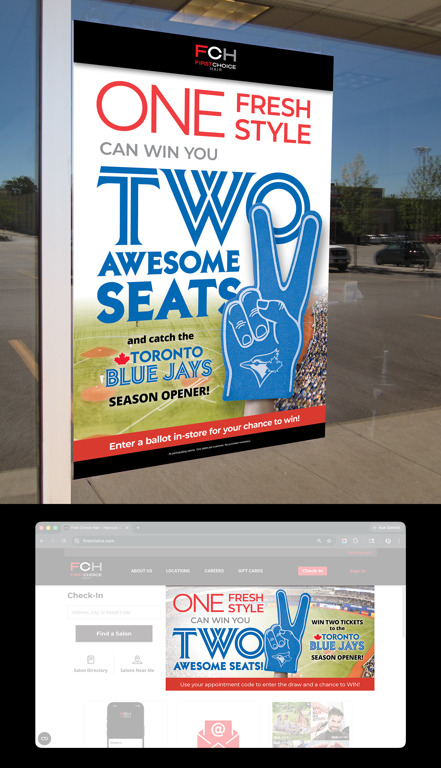
First Choice Hair
– Blue Jays Promotion • Online & In-store
– Blue Jays Promotion • Online & In-store
Role
Art Direction
Objective/Challenge
2-day turnaround from concept to final artwork.
Art Direction
Objective/Challenge
2-day turnaround from concept to final artwork.
Solution
The ubiquitous sports foam finger was the perfect solution associating immediately with sports. With the prize being winning two tickets, I quickly turned the single-finger pointing into a two-finger version – simple and perfect. Succinct copy allowed for large impactful typography visible from a distance.
In-store posters and website banners ads were produced.
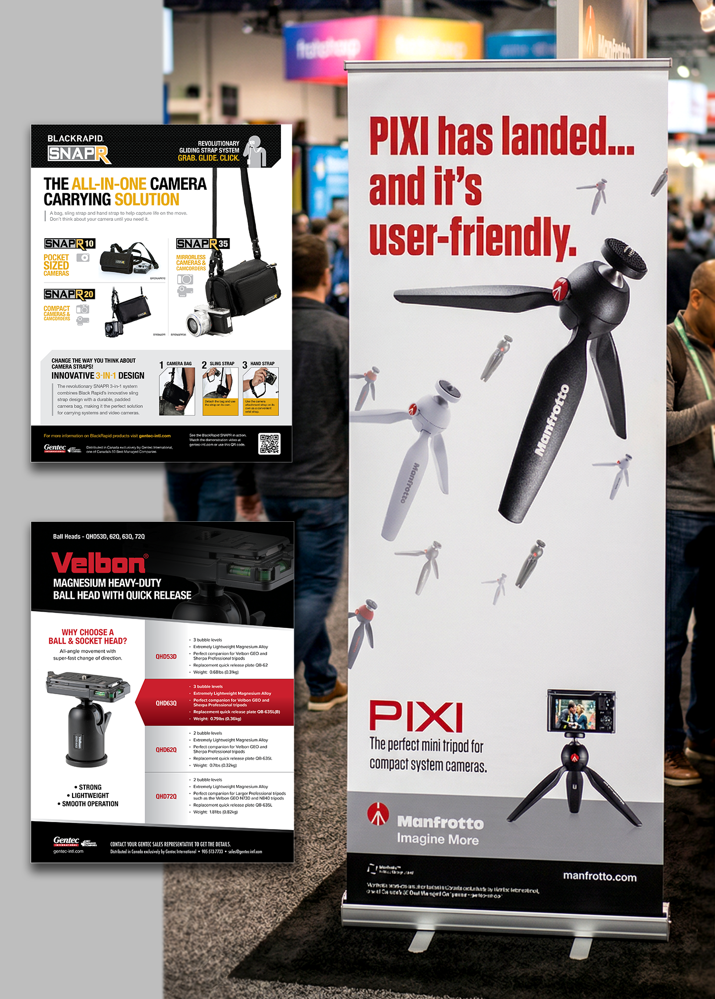
Gentec International
– Sell sheets, Posters, Banners
– Sell sheets, Posters, Banners
Background
Gentec International is a leading Canadian distributor specializing in consumer electronics, imaging, and audio products.
Gentec International is a leading Canadian distributor specializing in consumer electronics, imaging, and audio products.
Role
Art direction and copywriting/editing of posters, sell sheets, decals and display-related items.
Art direction and copywriting/editing of posters, sell sheets, decals and display-related items.
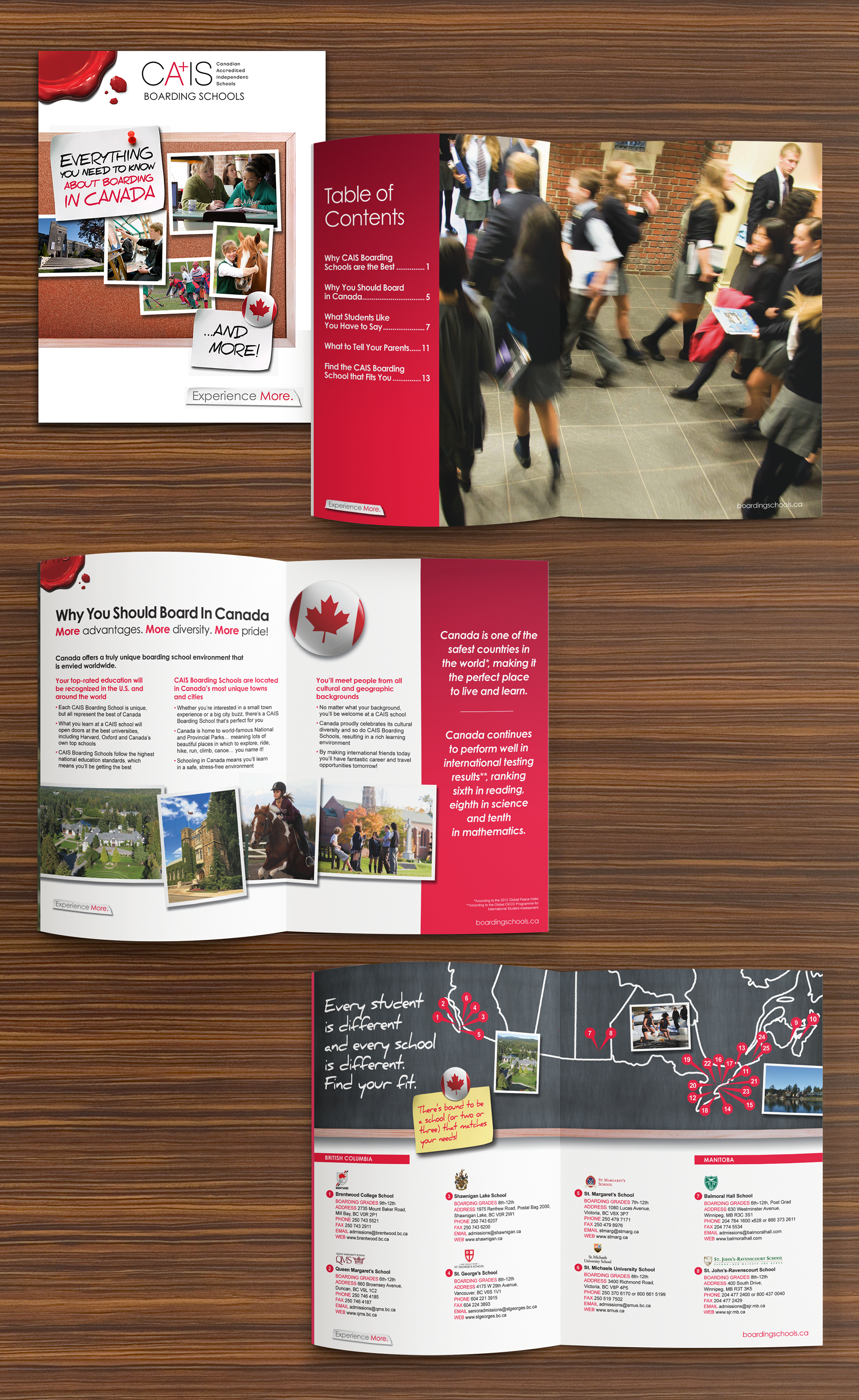
Canadian Accredited Independent Schools (CAIS)
– Information Brochure • Online
– Information Brochure • Online
Role
Art Direction
Art Direction
Objective/Challenge
Design and development of a PDF utilizing existing CAIS Boarding brand personality. Primary and secondary target audience are prospective domestic students and their parents respectively. Design to visually engage audience and essential information to prospective students about the benefits of boarding education in Canada at a CAIS school.
Solution
Using existing brand guide alongside high-quality photography, the final design visually engages the student with it's casual yet professional style. Engagement was enhanced using current student testimonials and real-life stories. Resource links and CTAs were highlighted and peppered throughout the PDF.
Using existing brand guide alongside high-quality photography, the final design visually engages the student with it's casual yet professional style. Engagement was enhanced using current student testimonials and real-life stories. Resource links and CTAs were highlighted and peppered throughout the PDF.